
Chaos Theory
Miranda Viskatis
“I don’t just see it as a flat, purely aesthetic image. It’s trying to tell me something.”
Interview by C. VanWinkle
Let’s start at the beginning. What did you respond to?
My prompt was a drawing of what I recognized as the golden ratio, within it mathematical sketches or drawings, and all encapsulated by this thread with a needle at the end. A very provocative image. I have some background in math, or at least enjoyed it enough to take classes in college. The golden ratio was actually something that I knew about very peripherally, but upon seeing this image, I was like, Okay now I have to know exactly what the elusive quality of the golden ratio is, and what its history is, because I didn’t know it. That’s how I started to respond to this prompt: looking up YouTube videos describing what the golden ratio is and how it appears in both art and nature.
It sounds like this was a good prompt for you. You already have a relationship with the subject matter.
Well yeah, I don’t just see it as a flat, purely aesthetic image. It’s trying to tell me something.
Did you have an idea right away what you wanted to do with it or did that take some time?
That took some time. Initially, I happened to have a lot of collage material and one of the fragments was this old map. That reminded me of this other piece of a collage thing that I collected was that image of an arched guy with the metal shield encasing it. Do you know what I mean? I don’t know the exact name, but I found it in a vintage LIFE magazine from the 70s. The article was, I believe, about an underwater training camp for astronauts. I could be entirely wrong but that is my description, straight from the gut. If you see what I’m talking about, you’ll know it. Anyway, I thought that these two went together. So my first step was pairing the suspended, floating guy with this map and a giving it a curved shape that reminded me of the golden ratio drawing. At first it was pretty rudimentary. “Oh this kind of looks like it.” And then also maps, just because part of the prompt image has, not cartography exactly, but fragments of celestial objects and spheres and math. I thought that there’s a parallel to be drawn there.
What happened next? How did you get from there to here?
Well then I couched it for a couple weeks. Or, you know, let that simmer in the back of my mind just because I didn’t know where to go with this this pairing that I made. It was obviously incomplete, but I didn’t see an immediate next step for it. Closer to the deadline, I participated in this Risograph zine workshop thing and I made a submission for that, which kind of forced me to work within the photoshop realm of thinking of negative space and positive space and how that would look overlapped with each other.
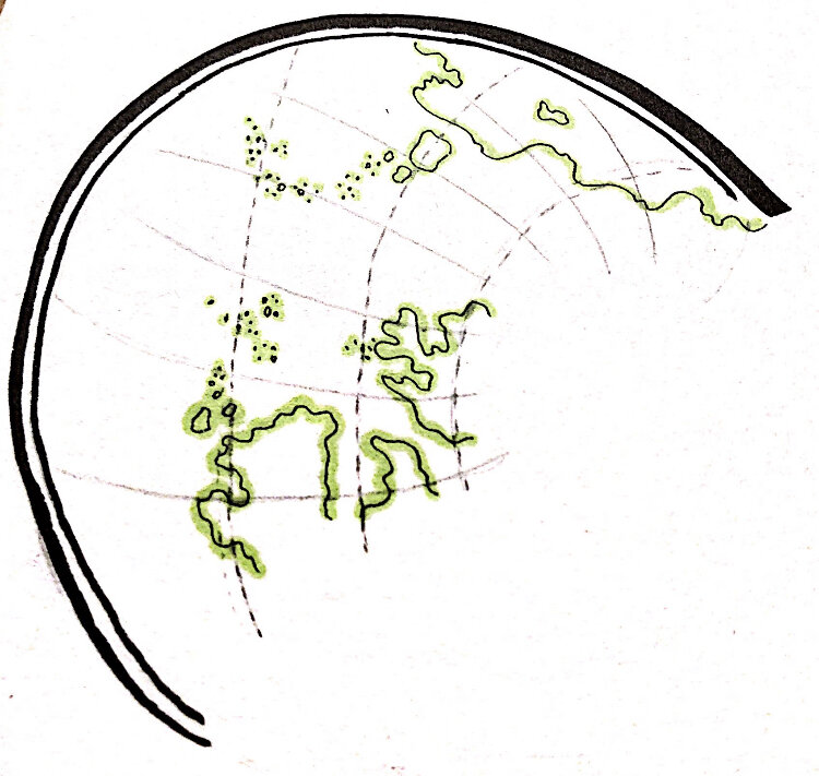
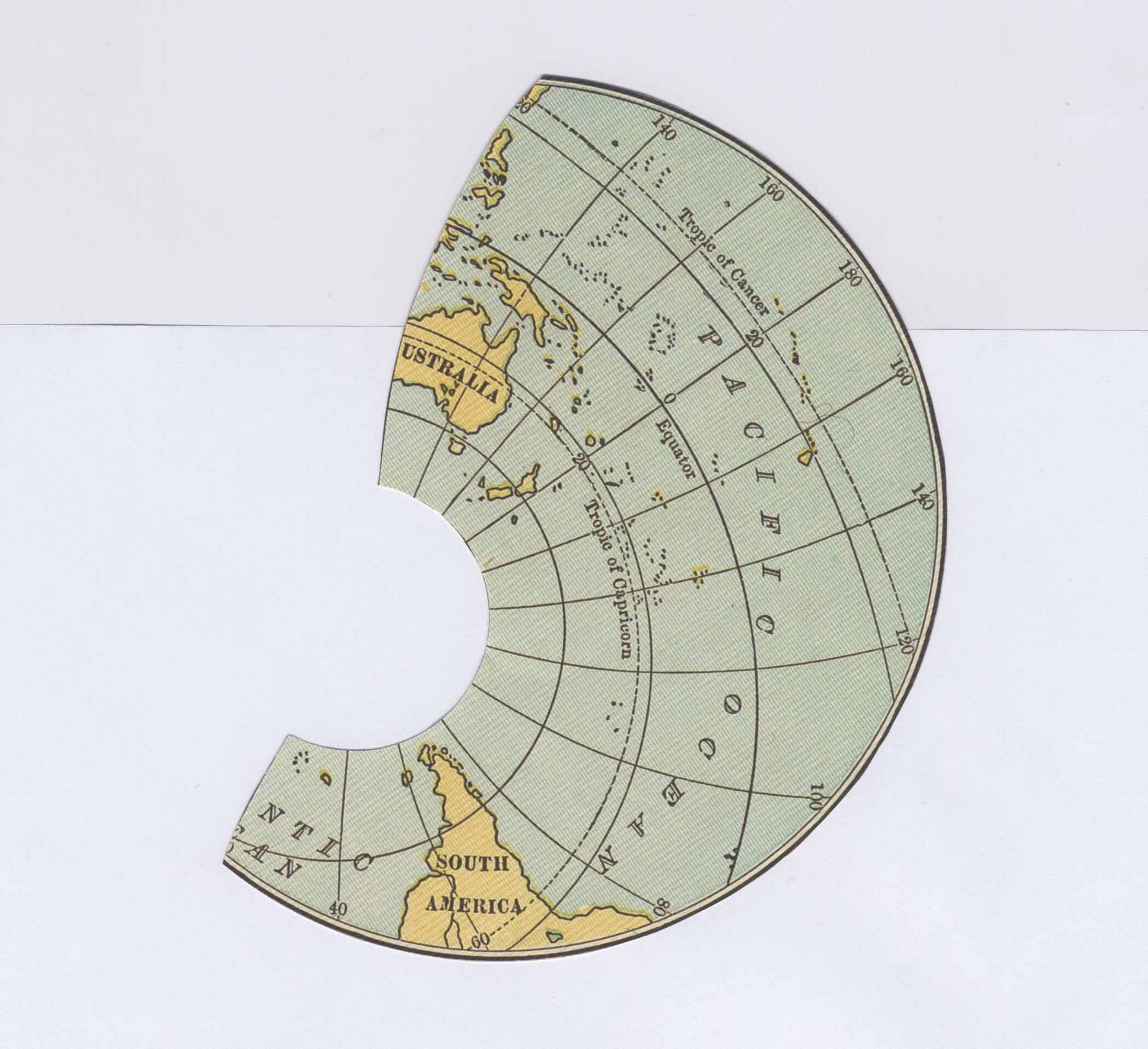
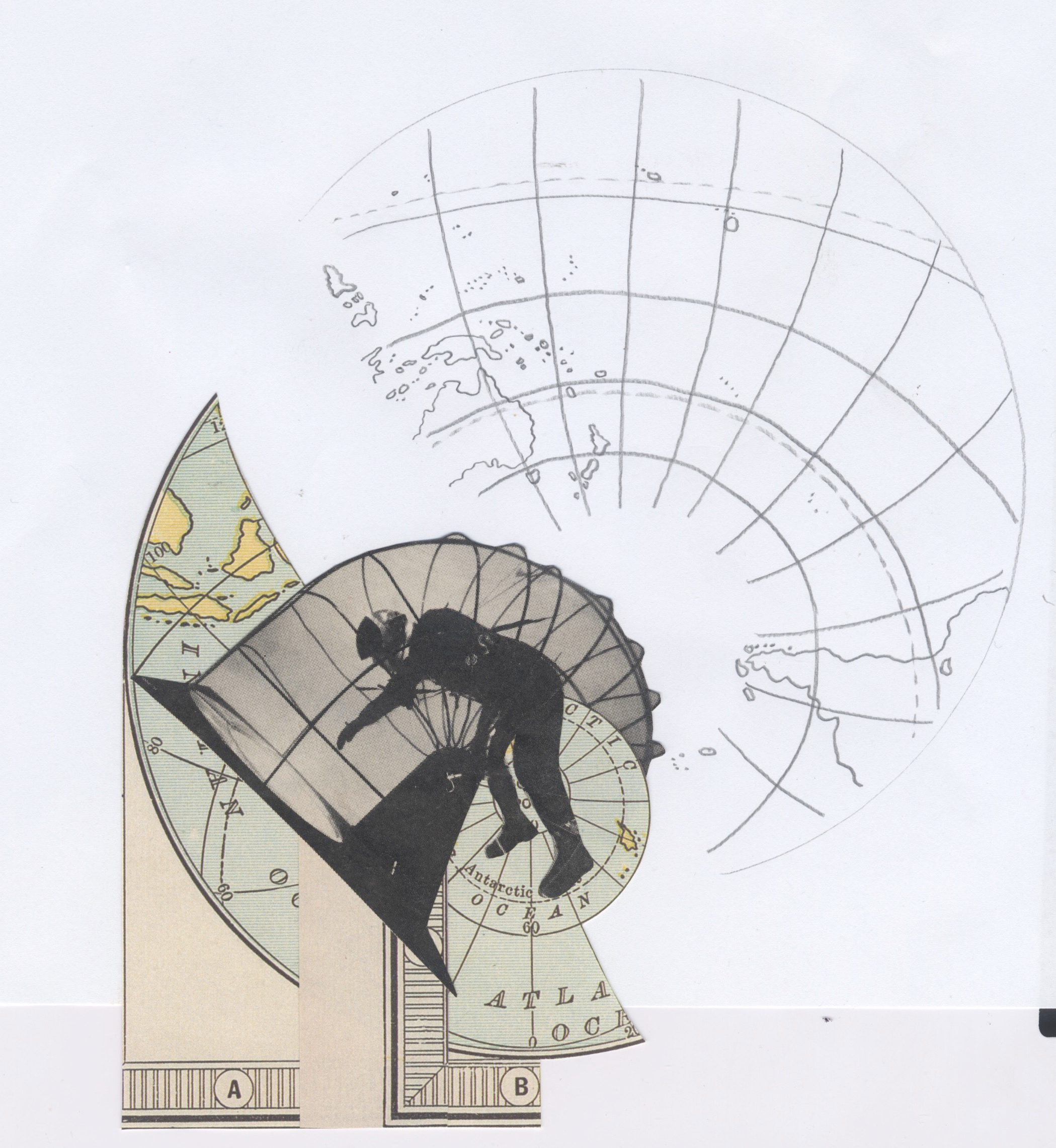
I think that’s when I realized that’s what I could do with what I have for the Bait/Switch stuff. So I scanned what I had and tried pairing it with my own drawing of completing the map. It was like a globe map that I cut out half of, and tried to draw the other half. But I didn’t want to be so literal either and so I inverted stuff, deleted stuff and superimposed stuff, to the point where it started to look appealing to me or just more interesting than what I started with. I did want to add the drawing element to it, because the prompt image was a drawing, and some parts of it are actually collage. I wanted to mimic that in my own piece and not have it just be a pure collage.
If you think about where you started and where you ended, is your finished product the piece you set out to make?
I wasn’t envisioning the end product that I came up with at all at the beginning. I wanted to be a little more true to form and work with an actual golden ratio, but it started making my brain hurt too much to the point where I thought, This isn’t fun anymore! So I’m just gonna go with a more intuitive or impressionistic approach of what the golden ratio can be as a representation, rather than the actual thing.
How does this piece fit in with the rest of your work?
It’s closer to what I submitted to the Risograph zine thing because I started to get more comfortable with Photoshop. I actually want to transition into working with multimedia in that way, working with layers, working with taking stuff out, superimposing it so that there’s texture to it. My background is in photography and drawing, but they’ve always been quite separate. When I have my camera, it’s just to get images. When I’m drawing, it’s to make images. There was never a bridge between them. Now I started realizing that the more I play with Photoshop, the more I can bring the two together. That’s been a very exciting new direction for me in my art and it’s a very recent one. So I want to go more into this aesthetic realm that looks a lot like what I submitted.
That’s really cool. I think I have a habit of seeing different media as very separate or compartmentalized. It doesn’t occur to me to mix those two things together and I’m glad you’re exploring that. Maybe we all should!
Exactly. At least for me, the photograph isn’t necessarily the final frontier. When you take a picture, you can take it further and use it as collage material. That’s what I’m moving towards, working with more collage and seeing my own photography work as fodder for collage work.
Do you usually work in black and white?
With my photography, yes. I feel like I’m not ready to go into color yet, or like colors would be just a whole other set of variables to think about. So for now, I’m in the grayscale realm, which I’m happy with. It does make the process a little easier not having to think about color all the time. I mean, even for this piece, I did look at it in color and see if it was a better object than the black and white, but I ended up choosing the black and white. It seemed like a cleaner finish. My photography can be very high-contrast, bold images.
I’m not really a photographer, but I’ll set a picture in color and black and white, and try to think, What does this add? What does this subtract? What’s the difference? I’m starting to learn to think like that.
I think that black and white photography gets a bad rep of being pretentious. It seems to abstract the image, or it doesn’t seem to be as grounded. But I disagree. I can’t really express it all at the moment, but I do I hear you and I agree with you. It’s a good way to think. Again, this is not to be pretentious, but Tarkovsky talked about the movement from black and white to color. It’s only when you’ve mastered the black and white realm should you move to color. I don’t personally agree with that or want to postulate that, but I do think that it is a valid point to bring up, as far as how black and white images can make you think about composition. It helps you think about composition and negative and positive space. When you add color into that, it’s a whole new layer. You know, color theory is a whole section of art that is studied. And so it’s a big deal. I think that for beginners, black and white photography is the way to go.
Do you have any advice for someone else participating in this project?
Just make time for it, because it’s valuable. I’m just grateful for the opportunity. So I think it’s worth it to set aside a chunk of time to complete this project. You can just decide that, maybe for the next hour, I’m just going to work on this and not worry too much about where it’s going. The process is going to be awkward, so I think just giving yourself chunks of time, extended time to work on it, can be really liberating.
Call Number: C48VA | C50VA.viCha

Miranda Viskatis dabbles; in illustration, photography, watercolor, music, philosophy... A natural dilettante. She is curious about the world and what there is to know about it, which sometimes dizzies her to an incapacitating degree. Thank God for deadlines, otherwise she’d never complete a single thing.