

Temporary Rest, With Coal and Leaves
Georgina Lewis
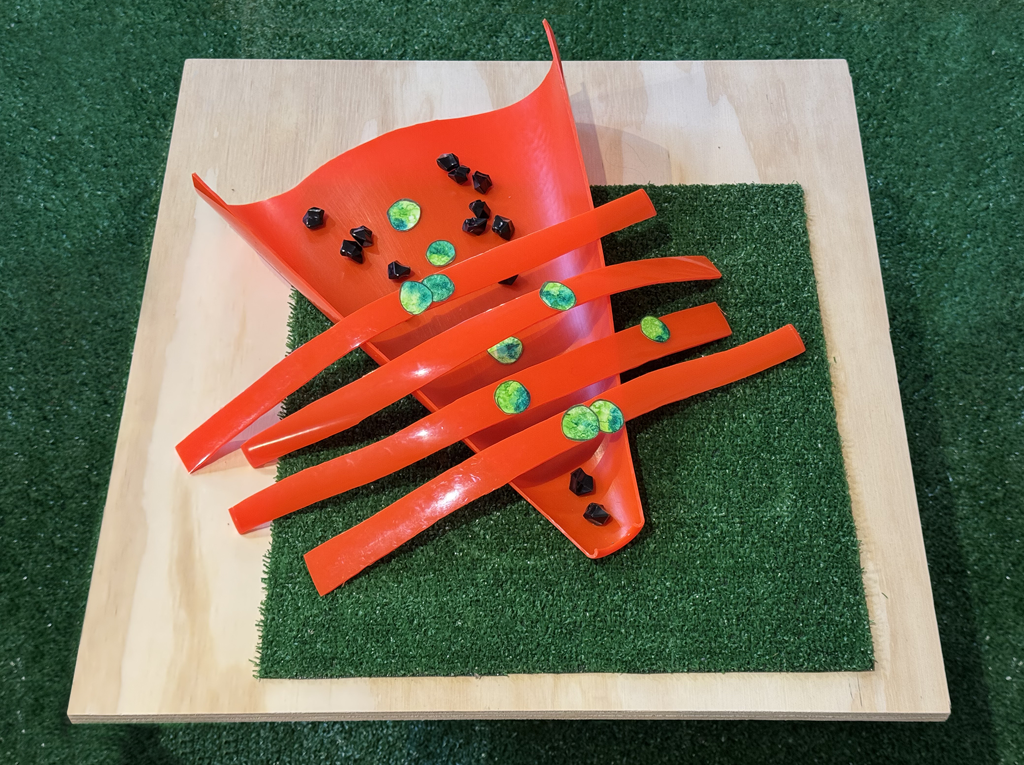
temporary rest, with coal and leaves, Watercolors, graphite, salt, sunlight and air, rubber caution cone, astroturf, plastic, and wood.
“It’s this weirdly perfect version of nature, which is also really kind of messed up. And so I think it’s kind of humorous.”
Interview by L. Valena
April 17, 2025
Can you please describe the prompt that you responded to?
I think it’s a painting, as opposed to pastels or watercolors. It’s a triptych, which is really interesting. It’s not just a rectangular triptych, it has a curved bottom with an otherwise rectangular shape.
What were your first thoughts and feelings about this?
The first thing that struck me was the shape or shapes, followed by the colors, and the line quality – I may be getting the medium wrong, but to me it looks like ink pen – and then the tree branches. Especially the color, particularly the bluish green, because I am a huge fan of that area of the color spectrum.
Awesome. And where did you go from there?
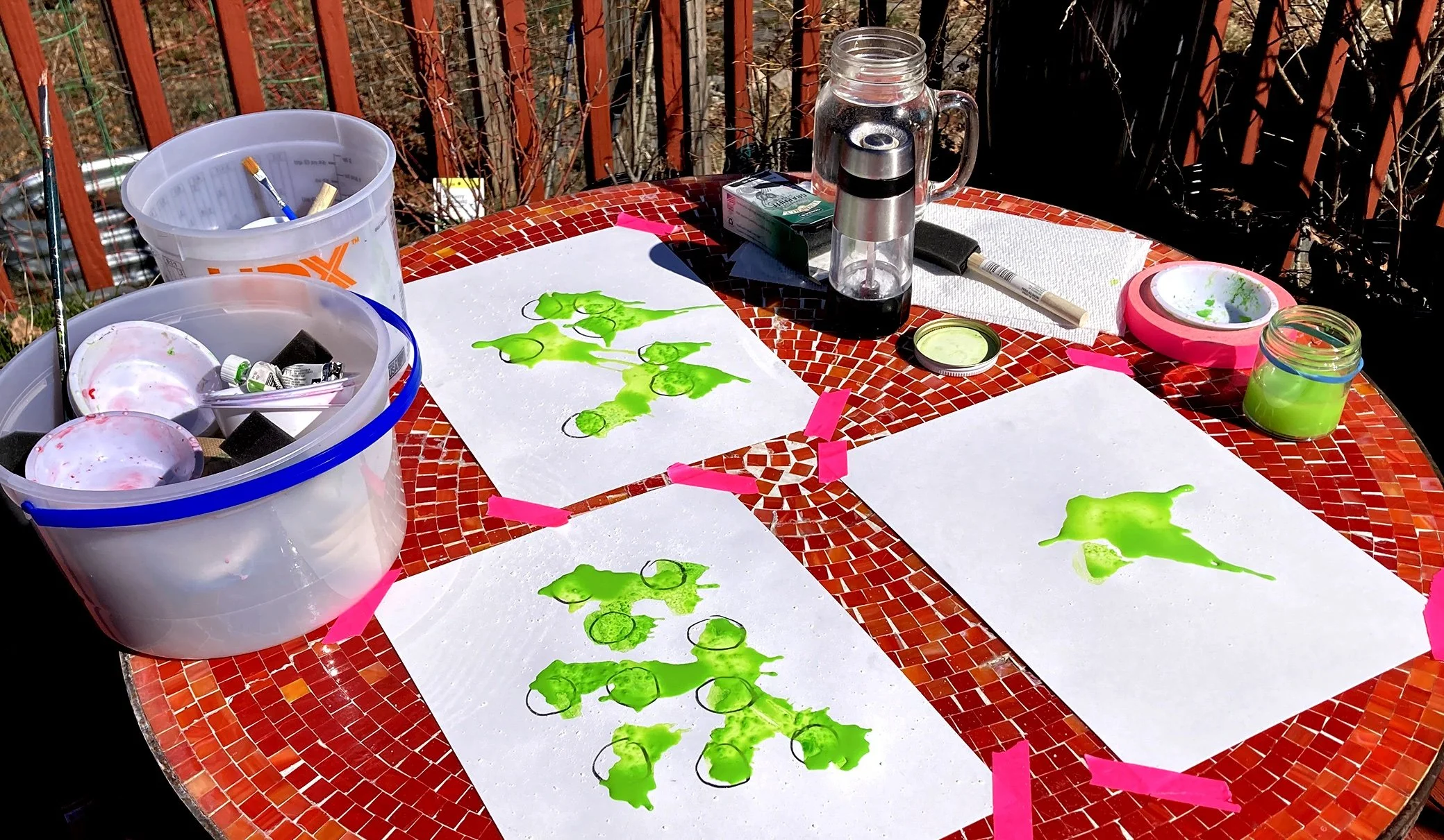
I should also say that it’s a depiction of nature: a tree, and rocks, and blue, sort of watery qualities. I really like that color of blue or bluish green. I’ve actually been playing around with watercolors that are the same kind of colors. I didn’t want to just do the thing that I’ve been doing because that doesn’t seem like a response. That’s just shouting over somebody or something. So I drew circles in graphite on some bristol board, thickish paper, and then did some of the same watercolor things that I’ve been doing on top of it. I do it outside. A huge background interest for me is alchemy. I do these things outside so that the sun and the wind are also having some impact, particularly in the way that the pieces dry. And I use salt, which creates patterning and also determines, completely out of my control, how exactly the paints dry and meld together.
Have you been working with salt? Is that something that’s been part of your process lately?
I actually have been for a while. It’s embarrassing how long ago it is now because it’s pre-pandemic. I spent some time in Salzburg, Austria. Salzburg, salt. It’s a beautiful place and also primed for tourists. There’s all sorts of little stores where you can buy blocks of salt and that sort of thing. So I think that was the genesis of the interest in salt and at the same time a growing interest in alchemy. I use salt in various ways, but particularly now with the watercolors because it’s a fascinating set of patterns. They look like something you’d see under a microscope.
So you did this painting technique outside, with the salt. What happened next?
I think I went in the wrong direction [laughs]. I cut out some of the circles and I put them on a piece of balsa wood that I have. I’m a big fan of glittery things and I have some bulk sequin roll foil that I also realized looks like tree bark, but in a different color palette. It’s white and violet and blue. I put that on some shiny, black plexi and put the dots on top of it and let them sit for a couple of days. My thought was, at that point, about the difference between using the actual materials and some level of reproduction/mimicry. I looked at it a couple of days later and I was like, “That’s horrible! It’s not really a response and it’s also not me.” It was just some weird, intermediary thing. It got me asking myself what exactly is a response? I think I know what a verbal and vocal response or a conversation is like, but I realized I wasn’t quite sure.
There’s no right or wrong answer to that question.
But it did feel like, to have a response, it had to be me responding, and so the thing I’d started work on was ultimately not me. I went to my studio a day later and started doing something that I thought would be part of the piece in process. I’m fascinated with orange caution cones, so I had this tiny piece of orange caution cone at home and I was planning on just cutting one longer strip. When I started cutting up the cone, that’s when it actually started to feel like, “Oh wait! Here’s that shape. Here actually is a response.”
Tell me a little bit more about traffic cones.

First of all, I just love that color. It’s so vibrant. I find that, over time as our little world gets really strange, vibrant colors just perk me up. And hopefully they perk other people up too. But then they’re also a literal signal or visual metaphor for, “Ah! There’s a problem here.” I also like them because they work a lot with nature-adjacent subject matter. It may be adjacent in my mind and multiple steps in someone else's mind. I just think they’re cool. I love the material and its shiny quality. I love that they’re these perfectly machine-made objects that you can hack apart and then suddenly they’re very imperfect.
I love that phrase “nature-adjacent,” especially when I think about being in an urban environment. We have these aspects of our built environment that we are walking through all the time, that are part of our landscape, you know? And they’re not part of the natural world, but they may as well be, right? For us city dwellers, they’re just there. Astroturf is another thing that reminds me of that. Talk to me about astroturf.
In my mind, it has a lot of the same characteristics as caution cones in that it’s this mass-produced substance or material – I don’t know what you’d really call it. All of the little plastic blades of grass are the same height and the same width. It’s this weirdly perfect version of nature, which is also really kind of messed up. And so I think it’s kind of humorous. Caution cones are a little bit humorous too. Astroturf also is from the era when real grass was being taken out and astroturf was being put into football stadiums, or people put it on the side of their pools or something. It’s nature-adjacent and sort of the whole anthropocene – so encapsulated.
How does this piece relate to the rest of your work?
It really is a bit of a step, which is awesome. I’m very excited to have made something that, yes, is my work, but is a little bit different. I have been working with caution cones recently, putting sculptural things on top of them so that you see the base and some of the cone, but not the whole thing. So they’re like weird supports. I think I’m very anti-pedestal, the phenomenon of everything being on a white pedestal of a set height. I like putting things at different levels and using things like plastic bins. Home Depot has these great, vibrant orange, five-gallon buckets. I’ve been working with many of these materials, but not presenting them in this way or with this breakdown of shapes. For instance, what I’ve been doing with the watercolors is just making a big thing on one piece of paper, a single shape on a piece of paper, no drawing involved.
Something about the strips is different, and it also goes back to my initial thoughts. I had a bunch of different thoughts about how I might respond, and with a lot of them I outright thought, “That’s not it,” without even starting. One of them was actually to do a bar graph, an almost scientific analysis of the color components of the original piece. Like, the green bar would be this size, the gray one would be smaller. But something about the idea of having bars stuck with me and that’s new.
That’s great. That’s the whole goal, to allow for something new to show itself and see if there’s new paths that open up as a result. Because you just never know!
I so appreciate that because it really did. This idea of having these weird little dots of color, too, is something I wouldn’t have thought of otherwise. And that was because of those inner black lines in the original piece, trying to think about how to indicate a difference between line width and the overall size of the piece.
How did you decide on how many little stones and pieces of tape to use? Are they arbitrary numbers?
They kind of are! For the stones, I have a bag of them, so I couldn’t have put much more in. I did have more uncut circles from other pieces of paper. I think that arranging things is really important for me because my background is actually in sound. My degrees are in sound art. I don’t really do that anymore, but there’s always this basic sense of composition in the back of my mind about how much of something is too much versus not enough to give an impression. And then there’s also a really intuitive response. There’s absolutely no rational reason for why any of those are in the places they are. It just felt right to me as I was laying it out.
That’s cool. Now that you’re talking about sound it’s interesting to think about the lines and dots. [laughter] What would this sound like if you played it?
Oh my god. That’s so great. This has happened to me before. During the start of the pandemic, I actually was doing drawings of circles. I come back to that shape periodically. There’s something really satisfying to me about making this shape and the sound of the graphite and everything. A friend of mine, a musician named Howard Martin, said to me, “Oh can I turn that into a score.” So in spite of having that experience, this time around I totally failed to think of that. That’s me.
I would love to hear it! Is there anything else that you wish people knew about your work?
I often want people to take abstractions in their abstract sense and respond to them emotionally, as opposed to applying a more literal or rational decoding of them. And another thing that I wish people would get from the work is that I tend to approach things with a bit of a sense of humor. People can feel uncomfortable acknowledging that there’s humor in something because, if they made a mistake, it’s horribly embarrassing for them and for the artist. In my work, if you think it’s funny, there is supposed to be some humor in there.
Do you have any advice for another artist approaching this for the first time, responding to a prompt like this?
Let it grow on you. I think that when I first looked at it, I wasn’t properly looking and feeling it. Therefore, my responses were not to it. Me not being in it, I was doing neither of us a favor. I really needed to take the time to let it grow on me. The idea of sleeping on something. Not that things necessarily come in your dreams, but to maybe lose your first impressions. Or, if they’re right, go with them, but be willing to have second and third impressions.
Call Number: R99VA | R100VA.leTe
Trained as a sound artist, Georgina Lewis (she/her) works across media, using photography, installation, drawing, and sculpture to make pieces that examine dissonance: what tensions and artifacts result when one or more things come in contact. She received her MFA from Bard College and holds undergraduate degrees from SMFA at Tufts University and Franklin and Marshall College. Her work has been presented at numerous venues, including Montserrat College of Art’s Frame 301 Gallery, Boston University's 808 gallery, Grapefruits Art Space, Portland, OR, the Mills Gallery, and Boston Cyberarts.