

Before I Go
Quinn Miller
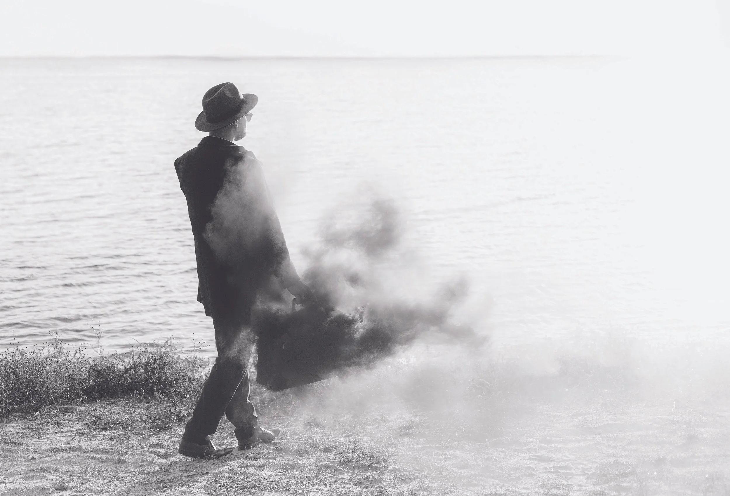
Before I Go, Digital photograph, 24 x 18 inches
“There’s no way a little suitcase can contain all the emotion of leaving.”
Interview by L. Valena
March 1, 2025
Could you please start by describing the prompt that you responded to?
The prompt I received was a song titled “Before You Run.” One of the things I love about Bait/Switch is that you never know what you’re going to get. As a music lover, I was excited to get a musical composition. Immediately I noticed the texture of the audio. It was grungy and had the quality of white noise. Then, as I listened through the song, I heard the different melodies and the lyrics, “before you run.” The gears started turning for me. I began to ponder how I could incorporate the grungy texture and the meaning of lyrics into a new piece.
What happened next? Where did you go from there?
After I thought about 90s grunge, the next thing that came to mind was black and white. Then the association with white noise came up again. I don't often work in black and white, so I thought I’d challenge myself.
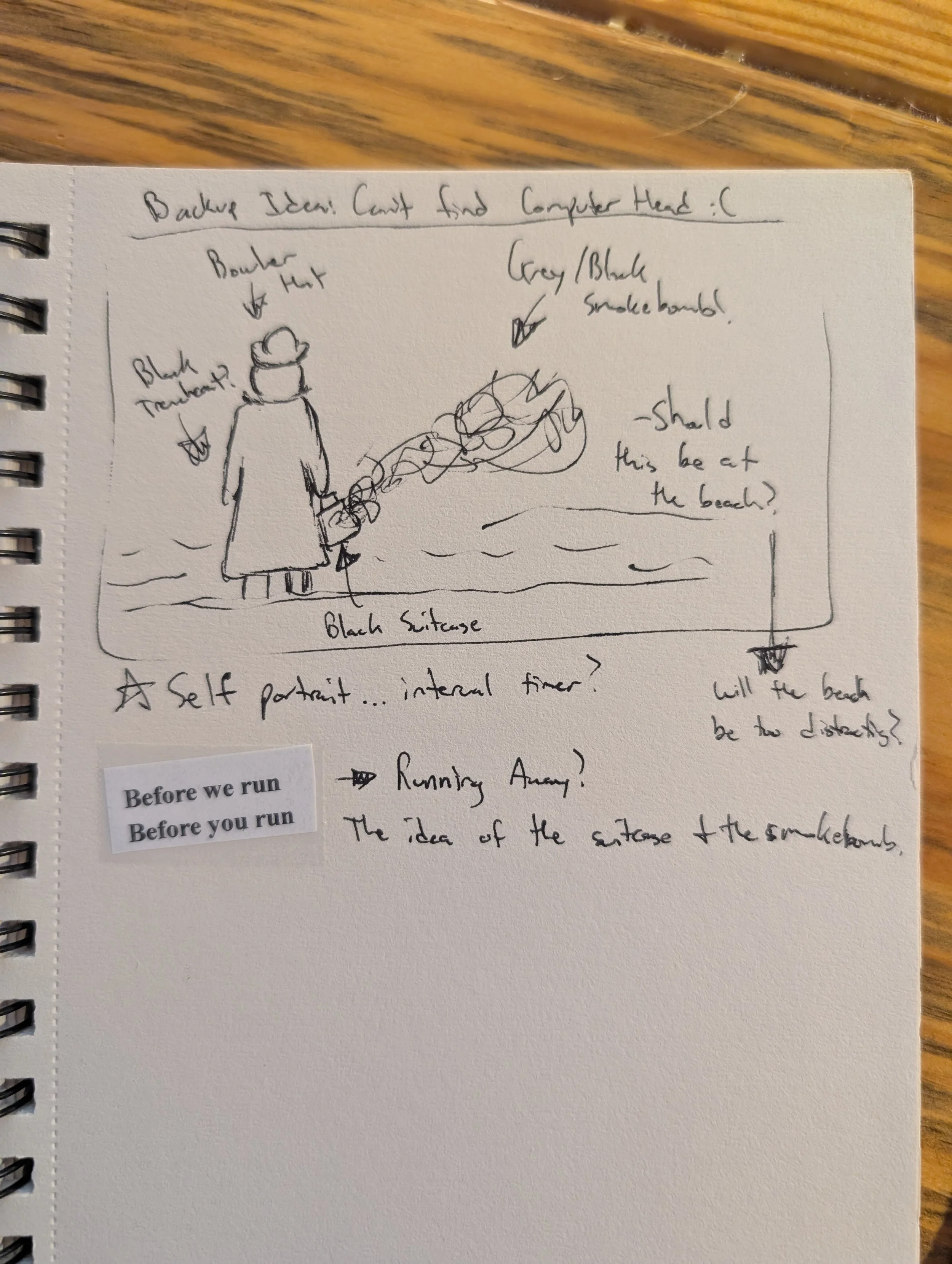
I started conceptualizing the piece around this old computer head I thought I had lying around. I’d gutted it so you could wear it. I thought I could play with the idea of the computer head and white noise.
Next, I began paying more attention to the lyrics. One of the first things the artist, Punky D, says is “one more log to burn before they attack.” I really focused on fire and the log burning, perhaps imagining it in black and white. I also wanted to incorporate running in some way. I thought about the old box TVs that we used to watch growing up—if they were messed up, you would see these constant, revolving lines. What if I incorporated a similar glitching effect or loop of someone running on the TV screen?
But long story short, I discovered that I had lost the computer head.
Noooo!
Yeah, it’s really sad. I’d had it since college. I have a sneaking suspicion it got thrown away. But I digress! My whole idea revolved around the computer head, and in classic Quinn fashion, I procrastinated until the last second possible. So the photograph you see now was a pivot.
I started thinking about the title of the prompt again. I ended up titling my piece “Before I Go,” and the concept is about someone having to leave somewhere, for whatever reason. The suitcase is trying to contain all the feelings, ideas, and anxieties around leaving for a new place, but there's no way a little suitcase can contain all the emotion of leaving. The black smoke bomb is a nod to the log burning, a little Easter egg.
I love this piece. I think it's gorgeous. The fear of having to flee has been on the minds of many people in my community. I'm wondering if that's something you've encountered on your paths?
The model is my husband, who actually fled Cuba. Conceptually, the black smoke bomb is cool, but it also points to awful scenarios. If your house is on fire, what are the three things you grab? If you had a moment's notice to leave your home or your country, how do you reconcile all those emotions? In the original photo, you can see houses on the coast, but I photoshopped them out because I wanted to show the ambiguity of not knowing where one is going through the smoke.
With current events, I know that a lot of people will resonate with this photo. The situation is unfortunate, but there is a beauty in art—knowing that people will resonate in their own way because of the specific paths they walk.
Yeah, there is a cathartic quality to this photo. I also love that he's wearing a hat and sunglasses, like a disguise. I don't know if you intended that.
I’ll steal that interpretation, seriously! All my models are friends and family, and one of my problems is that I usually have them wear the same stuff. I’m bad at fashion. I was going for the look of a classic traveler. The sunglasses worked because it was bright out, and we live in South Florida, so no one wears long trench coats. When the scene and outfit all came together, it absolutely made me think of a traveler who’s fleeing. I do like the disguise interpretation, though!
Tell me about the smoke bomb.
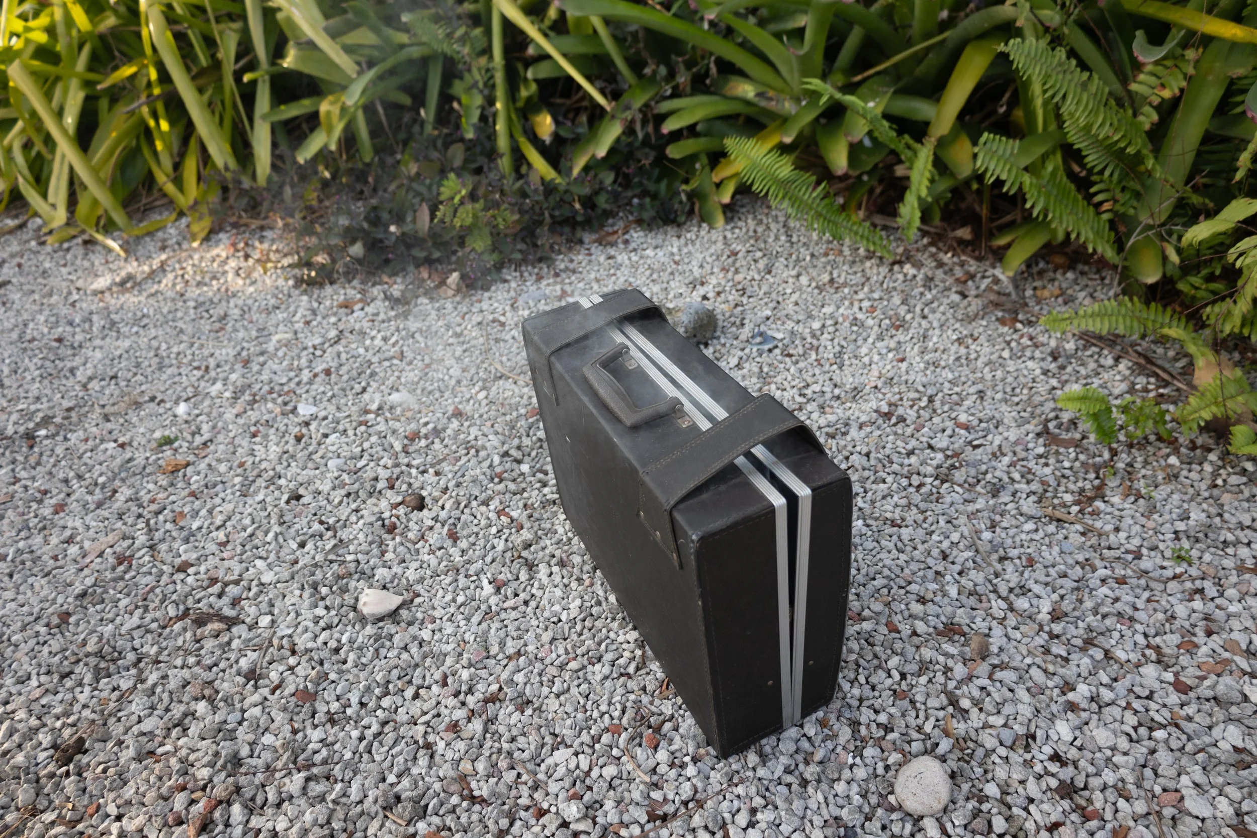
Immediately after graduating from college in 2014, I found an old vintage blue suitcase, and my buddy and I threw a blue smoke bomb in it. I thought it would make a really cool photo, and to this day it’s one of my all-time favorites. That eventually led me to photograph red and yellow smoke bombs. Primary colors are my favorite. Since then I’ve done some secondary colors, too—orange, purple, and green. The Bait/Switch prompt was a great excuse to attempt a black smoke bomb.
I wanted to take the photo on the beach, but my spouse thought people might call the cops. There aren’t fireworks laws in South Florida, but still, the black smoke might look like real fire. We ended up doing it in a local park when it was pretty much empty, except one guy and his dog. These bombs pump out a lot of smoke. They go for over a minute, so I was able to take many photos. Unfortunately, as soon as I started shooting, a huge gust of wind came and went straight for the guy and the dog. I was so embarrassed and mortified. I looked over afterwards, and he was still there, but we left in a hurry.
What haven't we talked about? How does this piece relate to the rest of your work?
Like I said earlier, I don't usually work in black and white. I’ve had an ongoing series for the past two or three years called Mental. It's about mental health for men. Many guys don't like to talk about our feelings, and so I generally reserve the black-and-white aesthetic for that portion of my work.
Another thing. Besides the purple one, I took all of the shots for the smoke bomb series in-camera without much digital editing. I recently participated in my first art fair, ArtiGras in South Florida. It was fun and interesting to see the “loading screens” in people's brains when they saw my works that are clearly photoshopped next to others like the smoke bomb series. It makes them ask, is this photoshopped? My biggest inspiration is Erik Johansson, a Swedish photographer whose work also toes this line. It’s clearly photoshopped, but it looks so natural that it makes you second-guess reality.
So anyways, with this prompt I wanted to continue challenging myself to do as few edits as possible. I edited out houses on the horizon like I said before, but that’s about it. I try to do as much in-camera photography as possible so that I'm mainly a photographer versus, you know, a compositor. Nothing wrong with that, though.
Awesome. One last question. Do you have any advice for another artist getting their prompt today?
As my second time doing this, I would say to give yourself permission not to dwell so much on the entire picture. As the artist, you get to dissect any little detail, and that's the beauty of this whole process. The ambiguity of the song was really fun for me, as there were literally no visuals. But I was able to pull from the lyrics. If you got a piece that was full of vibrant color, there's nothing that says you couldn't subtract all that color, make it black and white. It’s all about how you interpret it. And at the end of the day, it's just fun to practice your artistic being.
Anything else you want to say “on the record,” as it were?
Bait/Switch is awesome. I wish you nothing but the best success, and I hope anyone reading this enjoys my work and continues to support the magazine. And please, remember to support student artists. This is part of my mission as a teacher. Don’t support artists just because they're already successful. The world continuously needs more artists.
Call Number: V98MU | V99VA.miBe
Quinn Miller was born and raised in Clewiston, FL. He discovered his love for photography during middle school when exposed to the work of Erik Johansson. This led him to pursuing an education in the arts, where he found himself at South Florida Community College and Florida Gulf Coast University, attaining a Bachelor's in the Arts. He currently resides in Lake Worth, FL and teaches art at the High School level.